Interview
Escudoteca: Building a Digital Museum of Football Crests
Ester, the creator of Escudoteca, on Placar's crest magazines, a ghost from Paraná, Barcelona's lost “hairs” and why redesigns shouldn't strip a club of its soul.

By Leo4815162342 and Ester · 4 min read
Few countries mean as much to football as Brazil. It has won the World Cup five times, more than any other nation, and is the only country to have played at every men's World Cup. With 1,400+ players in leagues abroad, it also exports more footballers than anywhere else.
This goes down to the football logos and badges as well. Brazil has 26 states and its Federal District has a championship of its own, which makes the number of teams go in hundreds. Their crests are a world of their own: monograms, stars, ships, lions and at least one ghost. Brazil is one of the biggest countries on football-logos.cc, with 260+ logos, but even we cover only a small portion of them.
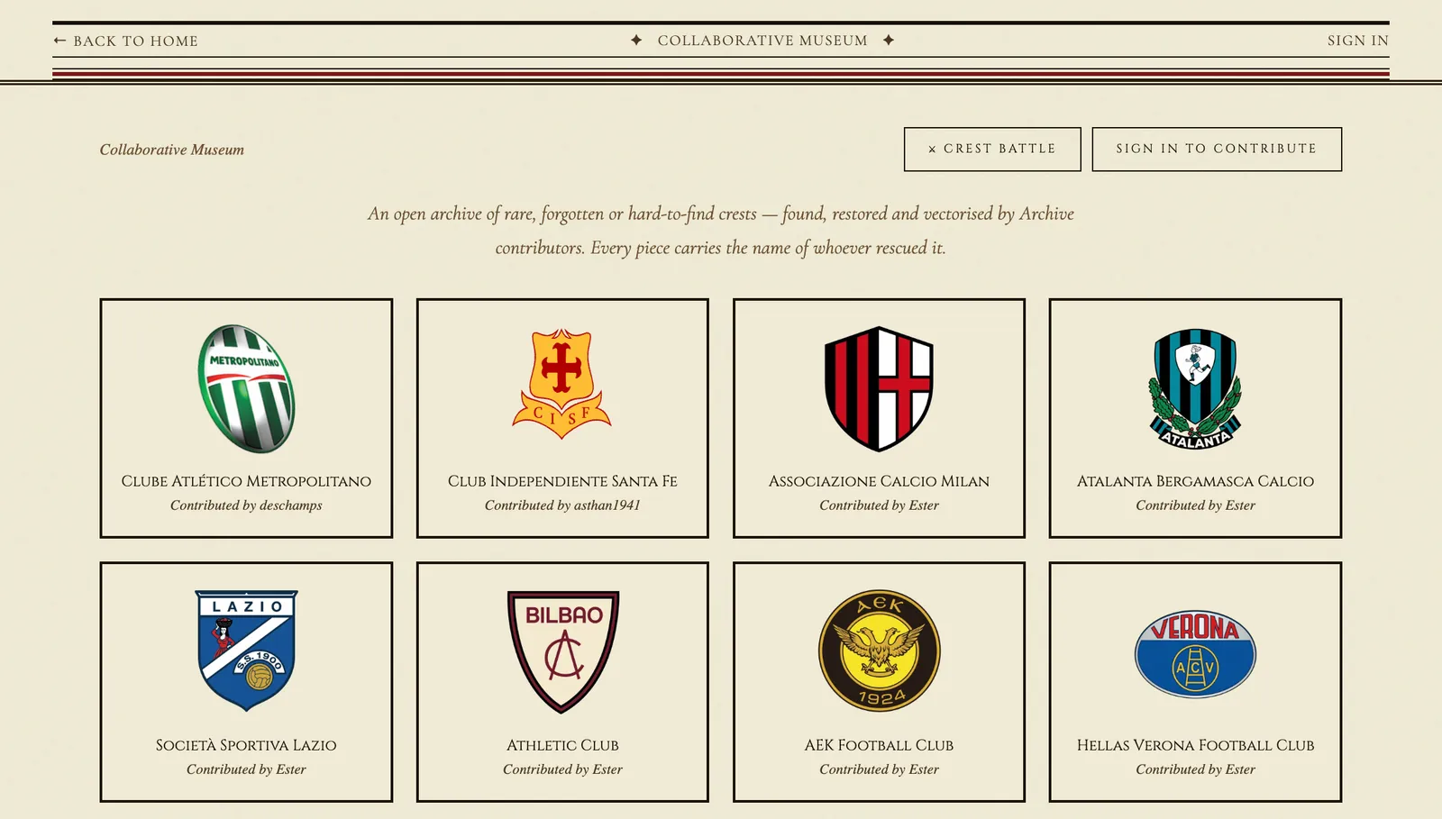
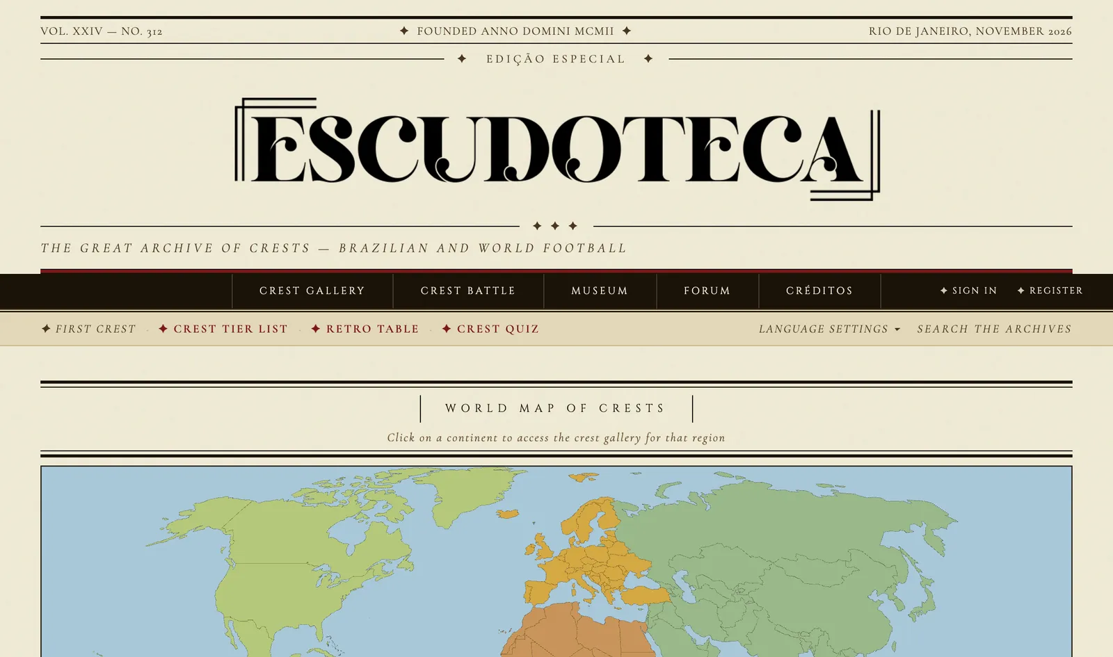
Ester, the creator of Escudoteca, wants to preserve that heritage and bring it to as many fans as possible. Escudoteca is styled as an old newspaper, the Gazeta dos Brasões do Futebol, and archives the crest histories of 1,500+ clubs from 70+ countries, including nearly 500 Brazilian clubs from every state. Its collaborative museum gathers rare and forgotten crests that contributors have found, restored and vectorized, while crest battles, tier lists and quizzes keep fans coming back, in Portuguese, English and Spanish.
We asked Ester how it all started, which Brazilian crest is the strangest, and whether modern redesigns are costing clubs their identity.
What originally sparked your interest in football logos, and what inspired you to create Escudoteca?
At Escudoteca, our passion for football crests started when we were very young, heavily inspired by classic PLACAR crest magazines in Brazil. Over time, that interest grew into deep research on the history and heraldry of the sport. Escudoteca was born from a desire to catalog, preserve, and showcase this rich visual identity that often gets forgotten in everyday football.
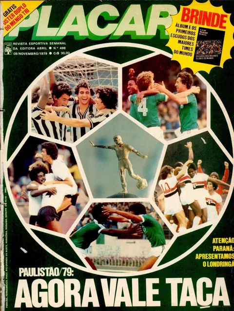

Placar's crest specials
Issue 498 of Placar, on 9 November 1979, came with an album for the crests of the world's 255 biggest clubs. In 1988 the special Escudos do Mundo Inteiro (“Crests of the whole world”) put a world map made of crests on its cover. Escudoteca's front page opens with a world map of crests too.
Covers: Acervo PLACAR
What's the most unusual or historically interesting Brazilian football crest you've discovered?
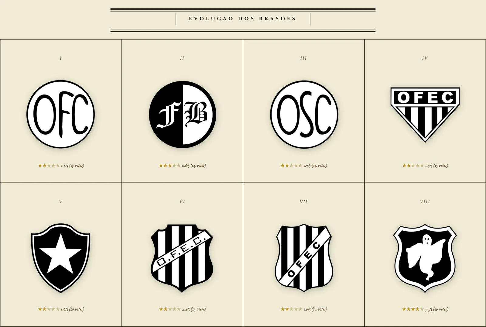
The most unusual one is undoubtedly the historical crest of Operário (PR), a team currently playing in Brazil's second division. Their old emblem prominently featured a ghost without any text or lettering—an extremely unconventional visual identity for Brazilian football.
What's the most surprising story you've uncovered behind a club's crest or its symbols?
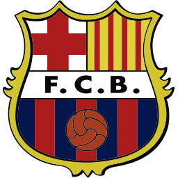
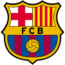
A fascinating story that few people notice is the evolution of FC Barcelona's crest over the decades. If you look closely at its timeline, the design gradually lost its fine internal linework—we playfully say it lost its 'hairs' over time—until reaching the streamlined, minimalist look we see today.
-
 1899–1906
-
 1906–1941
-
 1941–1949
-
 1949–1974
-
 1974–1978
-
 1978–2002
-
 Since 2002
What are your three favorite football crests, and what makes each one special?
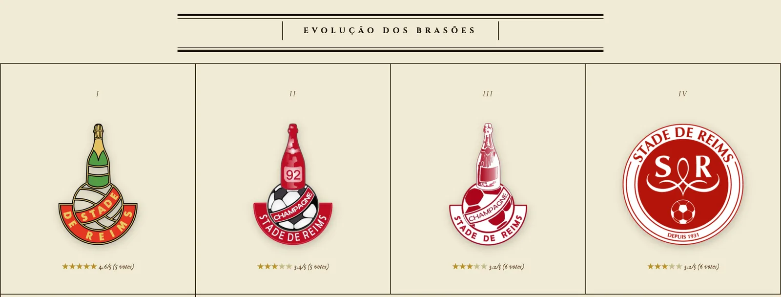
First of all, I have to highlight my own club, Vasco da Gama—its crest is incredibly unique, original, and rich in history. Second is Heart of Midlothian in Scotland, for its distinctive and iconic heart shape. Lastly, the classic Stade de Reims crest from France, which cleverly incorporated a champagne bottle to celebrate the tradition of its home region.
-
 Vasco da Gama Rio de Janeiro, Brazil Founded in 1898 by Portuguese immigrants as a rowing club. The caravel's sail carries the red cross fans call the Cruz de Malta.
PNG & SVG
-
 Heart of Midlothian Edinburgh, Scotland The heart is the Heart of Midlothian, a mosaic in the cobbles of the Royal Mile that marks the entrance of the old Tolbooth prison.
PNG & SVG
-
 Stade de Reims Reims, France The club grew out of the sports club of Parc Pommery, the park of a Reims champagne house. Today's crest swaps the bottle for an SR monogram and a crown.
PNG & SVG
How do you feel about modern football crest redesigns? Are clubs losing some of their identity?
I tend to be quite critical of modern redesigns, especially when extreme minimalism completely strips away a club's historical identity. Too often, brand updates sacrifice soul, tradition, and emotional connection with fans in pursuit of a generic, digital-first look.
What do you hope Escudoteca will become, and why is preserving football crests important to you?
My ultimate goal is for Escudoteca to become a digital museum dedicated to preserving the history of every football club in the world. Preserving these symbols keeps alive the culture, roots, and memories that make football so much more than just 90 minutes on a pitch, allowing fans to truly immerse themselves in each club's heritage.